APC Performance Metrics Benefit Computation

APC PERFORMANCE METRIC COMPUTATION 
SALES TOOL KIT
INTRO

Please ensure you adhere to the following guidelines before using the Probability Density Function toolkit:


1. Dataset Preparation

  1. File Naming
    Rename your CSV file to match the plant section being analyzed:

    • CementAPCToolKit_RawMill.csv

    • CementAPCToolKit_CoalMill.csv

    • CementAPCToolKit_Kiln.csv

    • CementAPCToolKit_CementMill.csv

  2. Header & Column Formatting

    • Include a single header row with clear labels for all dependent and independent variables.

    • Replace spaces with underscores (e.g., Elevator_Load rather than Elevator Load).

    • Omit units from column names; units should not be embedded in the header.

    • Ensure the feed column is labeled Total_Feed.

    • Columns may appear in any order.

  3. Data Formatting
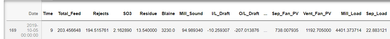
    Follow the formatting conventions illustrated in the provided screenshot (consistent delimiters, no embedded units, etc.).


2. Upload & Execution

  1. Upload

    • Click Select file, choose your preprocessed CSV, then click Upload.

  2. Run Analysis

    • Once the upload completes, click Run to execute the toolkit.

    • When prompted, specify the plant section by entering one of:

      RawMill | CoalMill | Kiln | CementMill

      (Use the exact suffix matching your file’s name.)


3. Support

If you encounter any issues:

  • Navigate to Contact, complete the contact form, and we will respond promptly.

  • Alternatively, email us at [email protected].


By following these steps, you will ensure a seamless experience and accurate PDF–based analysis.

Sales Tool Kit In Action

Tool Kit in Notebook Explained!

The APC performance metrics—Total Feed and Specific Power Consumption—were computed using Python 3. The following outline describes how to reproduce the Probability Density Function (PDF) analysis:

1. Environment Setup

  1. Development Environment

    • The examples below use Jupyter Notebook for demonstration.

    • If you run them in PyCharm, Spyder, or another IDE, you may need to adjust import paths or display settings.

  2. Required Libraries

🐍
filename.py
import pandas as pd         # Data loading and manipulation
import numpy as np          # Numerical operations
import matplotlib.pyplot as plt  # Plotting utilities
from scipy.stats import norm     # PDF computation

2. Data Import and Preparation

  1. Load the Dataset: Ensure the CSV conforms to the prescribed formatting rules (single header, Total_Feed column, underscore-separated names, etc.).

🐍
filename.py
df_on = pd.read_excel('Dataset_BM_online.xlsx')
df_on

   2. Sort by Total Feed

🐍
filename.py
df_on = df_on.sort_values(['Total_Feed'], ascending=True)
df_on

  3. Summarize your data

🐍
filename.py
df_on['Total_Feed'].describe()

3. Z-Score Computation

  1. Calculate Mean and Standard Deviation

🐍
filename.py
cols        = list(df_on.columns.values)
Feed_mu     = df_on[cols[3]].mean()
Feed_sigma  = df_on[cols[3]].std()
Feed_sigma

   2. Compute Z-Scores

🐍
filename.py
# z = (x – μ) / σ
df_on['z_score'] = (df_on.iloc[:, 2] - Feed_mu) / Feed_sigma
df_on

  3. Resort by Z-score

🐍
filename.py
df_on = df_on.sort_values(['z_score'], ascending=True)
df_on

  4. Save the enriched dataset

🐍
filename.py
df_on.to_excel('modv1_Dataset_BM_online.xlsx', index=False)
# — or —
df_on.to_csv('modv1_Dataset_BM_online.csv', index=False)

  5. (Re)import plotting utilities

🐍
filename.py
import numpy as np
from matplotlib.ticker import (
    StrMethodFormatter,
    AutoMinorLocator,
    FormatStrFormatter,
    MultipleLocator
)
%matplotlib inline

  6. Plot the PDF of z-scores

🐍
filename.py
ax = plt.subplot()
plt.title('Probability Density Function of Total Feed Online')
plt.plot(df_on['z_score'], norm.pdf(df_on['z_score'], 0, 1))
plt.xlabel('Total Feed Z score')
plt.ylabel('Density % distribution')

  7. Annotate mean and max points

🐍
filename.py
# Max
plt.axvline(df_on['z_score'].max(), color='red', linestyle='--', linewidth=3)
plt.axhline(norm.pdf(df_on['z_score'].max()), color='red', linestyle='--', linewidth=3)
# Mean
plt.axvline(df_on['z_score'].mean(), color='green', linestyle='--', linewidth=4)
plt.axhline(norm.pdf(df_on['z_score'].mean()), color='green', linestyle='--', linewidth=4)

  8. Configure x-axis ticks

🐍
filename.py
plt.xticks(
    np.arange(
        df_on['z_score'].min() - 1,
        df_on['z_score'].max() + 1,
        1
    )
)

  9. Format axis label precision

🐍
filename.py
plt.gca().yaxis.set_major_formatter(StrMethodFormatter('{x:.1f}'))
plt.gca().xaxis.set_major_formatter(StrMethodFormatter('{x:.2f}'))

  10. Add gridlines and minor ticks

🐍
filename.py
plt.grid(b=True, which='major', color='k', linestyle='-')
plt.grid(b=True, which='minor', color='r', linestyle=':', alpha=0.2)
plt.minorticks_on()

fig = plt.gcf()
fig.set_size_inches(15, 7.5, forward=True)
plt.savefig('Pdf_online.png', dpi=72, bbox_inches='tight')
plt.show()

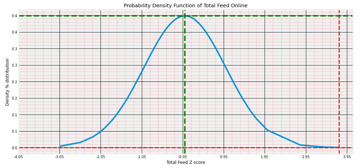
Probability Density Function of Total Feed and its Z-score density distribution.

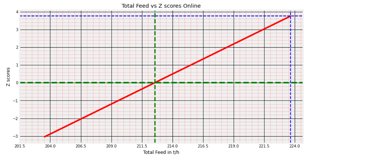
Total Feed vs Z-scores: To trace the % distribution of Total Feed samples from the PDF curve.

5. Output and Interpretation

  • Visualization: The resulting curve plots the standard-normal PDF against the computed z-scores, highlighting the distribution of your mill feed data.

  • Distribution Tracing: Overlaying your sample z-scores on this curve enables you to quantify the percentile position of any feed value.

Troubleshooting & Support

If you encounter any issues:

We will respond promptly to ensure your analysis proceeds smoothly.

Results That Build Reliability